Daily news, dev blogs, and stories from Game Developer straight to your inbox
Sponsored By
A comic-book style action shooter: creating the visual look of HAWKED
In this post, the art team behind HAWKED closely looks at the techniques and influences that give the game its comic book art style, and we’ll cover exactly how these were implemented, including the challenges that needed to be overcome in the process!
Margarita Borzykh
February 29, 2024
12 Min Read

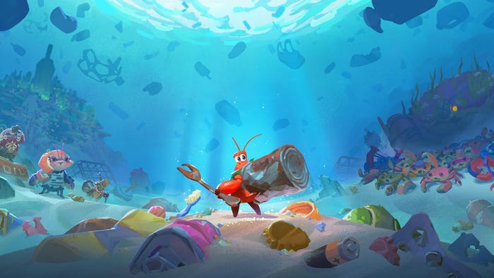
HAWKED is a third-person shooter adventure where players take on the role of a treasure hunter in the near future. Both the development of the game (and its visual style in particular) were marked by a huge amount of experiments, discoveries, and iterations. This was all part of the path necessary to achieve an excellent result.
Hello from MY.GAMES! We’re the art team behind HAWKED, and in this article, we’ll describe the process of creating the visual style of our game. We’ll talk about the formation of our creative approach, the search for a common concept, character and interface creation, and much more. Here’s the list of people, who contributed to writing this article: Art Producer Margarita Borzykh, Lead Character Concept Artist Ivan Eliasov, Lead Character 3D Artist Pavel Osharin, Lead Animator Leonid Miheev, and Lead UI/UX Designer Veniamin Borovikov.
The general features of HAWKED’s visual style
HAWKED’s visual style is based on two techniques: comic book and mixed media.
Yet, as is often done in comic-style projects, we didn’t want to limit the color palette and completely abandon PBR materials to simulate a 2D image. Instead, we tried to use various artistic techniques as used to create comic books and manga in different styles.
And we used it all:
Black and colored outlines
Watercolor stains
Virtual marker pens
Half-tone patterns
Brush strokes
Splashes of paint

Our style permeates every aspect of the game and is also noticeable at different scales: for example, at close range, we see it in the details of our objects; at mid-range, the colored outlines and spots on the outfits; and on a large scale with the slight desaturation of background objects to achieve a more uniform perspective.
One of the important features of the hand-drawn comic-book style is that objects don’t always look “perfect” – we can have paint beyond the outline or “smudge” the ink. We took advantage of this feature in HAWKED as well: these slight imperfections, alongside the liveliness of traditional drawing, fill our project with its charm on different levels, creating a holistic style; this can be observed in object textures, post-processes, interface, and other visual aspects of our game.

Creating characters for HAWKED
The treasure hunt setting allowed many options for character style and details; it provided creative freedom, and at the same time, this theme acts as a link to unite all the outfit elements with a singular idea.
When creating a character’s outfit, we moved from the general to the specific, adding tech-wear style – and a little fun.

When we started working on the main character, we began with the usual “adventurer” archetype – a young man in a hat and leather jacket. From there, the image quickly developed, details and ideas from modern design were added, and a light touch of cyberpunk and sci-fi elements. Using their visual attributes, we tried to answer basic questions about the character: “Who is this hero? Where do these events take place? When does the action take place?”
In addition, it was important that the hero’s image supported the gameplay itself: the purity and expressiveness of the outfit were designed to enhance and emphasize the game’s dynamics, so it needed to be devoid of any visual noise. With this in mind, we tried to get rid of any fine geometric details, both inside and outside the silhouette, and let the existing details be aligned with the overall rhythm while also increasing the amount of important characteristic elements.
Moreover, we tried to introduce decorative elements, such as ribbons or draperies; this not only affected the silhouette but also added secondary dynamics in movement. The space freed from these details was then filled with graphic texture elements and half-tone patterns from the shader.
After the first tests on shading and character modeling, we realized that we needed to highlight the difference between the materials: metal should shine, the fabric of a T-shirt should be distinct from a leather jacket, and so on. At the same time, the relevant details should be clear at different camera distances, and graphic accents needed to be added to increase attractiveness.

The first version of the shader that didn’t make it into the game
The graphics programmers quickly provided a shader option that added stripes and dots on shadowed areas and outlines drawn on the asset as a whole and elements within the silhouette.
At this stage, we realized that all the small elements needed to be larger so that their outlines would emphasize their shape instead of covering them.
In addition, the scale of elements like buckles, belts, fasteners, and other details on different parts of the outfit needed to match because the player can combine all kinds of clothing and accessories that should fit neatly together without stylistic conflict (in most cases).

The original shader calculated the crosshatch position in screen space without taking into account changes in the position of the object and its polygons during animation. The algorithm was then improved, and the hatch calculation was tied to the skeleton.
This was accomplished using special capsules, which in Unreal Engine are designed to calculate collisions of skeletal assets (Physics Asset). Each capsule is attached to a bone, and the shader reads the position and rotation angle of the capsule in space, so the correct hatch angle is calculated for each pixel on a model’s surface. Subsequently, we added half-tone patterns in the form of dots on the highlights.

Despite the sleek appearance of the surface, the structure of the material in the engine doesn’t look so simple:

As follows from the description, this method only works on skeletal meshes, so a different shader is used for static objects and environments. Additionally, half-tone pattern stripes are drawn on the locations inside the Ambient Occlusion pass, which visually create the effect of textured shadows.

The outline of the surrounding objects also has a uniform warm color, but the outline on the characters is two-tone since the black used everywhere otherwise made the picture too dark.
As a rule, we use warm and cool shades in pairs; they can be mixed with the object’s own color, taking into account the incidental light and simultaneously simulating backlight and shadow as needed.
Specific colors are selected by the lighting artist so that the character stands out against the background of the environment in any light.
To create outlines, we take a mask from a custom depth and build it from the object’s edges to its center; the thickness and transparency of the mask depend on the distance to the camera, and its parameters are non-linearly calculated. The mask is integrated with the custom shader model described above for optimization.

We figured out the procedural outlines pretty quickly, but the big challenge for the modelers, paradoxically, was the art director’s request for accent black strokes, which are similar to quick, sharp strokes in ink. We achieved this effect by adding a polygonal element that follows the topology of the suit, although this has a slight effect on the polycount at 0 LOD. Formulating an accurate algorithm for placing these polygons took some time, especially for soft, rounded shapes that look different depending on the angle.
We ended up adding these accents only in the portrait area and on the character's hands, where they are most visible when the game camera zooms in while shooting. Separate Unlit material guarantees 100% black color in any light.

These kinds of strokes look the most organic when used on hair. A hairstyle always contains two colors: the main one, with a brightness gradient from roots to tips, and an additional one, which is a noticeably more saturated color; we procedurally obtain this one from the main color and use it to color accent bright strands of hair. Thus, the hairstyle always looks voluminous, even in shade.

For environment objects and flora, similar strokes are added in a simplified form through a mesh decal, for which a small texture atlas with lines of different shapes is made.
The comic-book style limits the number of visual means when creating different materials, and moreover, the texture is small: lint, scratches, and other details conflict with the equally small half-tone pattern in the shader. Thus, we decided to almost completely abandon fine textures and leave only obvious ones, for example, the texture of a rope or large wool.

It might seem that eliminating textures would mean less work for us, but in reality, it became another challenge for modelers. After all, now we only have the shape of the surface to help convey the feeling of difference in materials.
This affected our production process, so the block-out stage (with the original shapes and proportions of the costume) began to take longer. This happened because it was now necessary to work out the silhouette especially carefully, operating only with the shape and plasticity of the lines and the scale of 3D elements, without counting on 2D detailing.
We paid special attention to shaping the folds, which we only created by hand; no procedural generators can do any of the following:
Guess the character, rhythm, size, and art direction that the concept artist identified.
Make the shape convincing enough so the viewer can immediately see the difference between the fabric and plastic.
Understand that one fabric looks definitively softer than the other.
If the edge of a material comes to the meeting points of the parts in a strictly defined way (because we have volume restrictions that cannot be violated).

Based on our experience with previous projects, we wanted to allow players to choose the colors of their character's outfit and developed a system using gradient maps.
Different areas of outfits and equipment are highlighted in masks and painted in harmonious colors, creating a cohesive look.

We experimented with different methods of coloring and creating gradients and tried different shapes of spots through which the colors mixed. Sometimes, we change this pattern, emphasizing the intended image for a suit or piece of equipment. Despite the hand-made appearance, all the materials are procedurally generated in Substance Designer.

Headwear, before and after
To make the materials more graphically appealing, we also added colored patterns of strokes, which are mixed into any material and have their own rich color. We are careful to ensure that the scale of these accents is consistent with the size of the subject and its position in the frame relative to the camera.

Principles of character animation
At the beginning of the project, we needed to define the “comic-book style” in terms of animation and how this style can be translated into motion. In comic books, there are always very clear and well-defined poses because the artist needs to use a static picture to convey a mood, character, and dynamics of the character’s movement, which a reader can instantly recognize while flipping through the comic book.
Although the player in HAWKED controls the hero’s actions, the camera in the game is fixed in a certain way, and we can customize the character’s movements so that they have a strong, expressive silhouette (in most cases).
To further entertain the player and move away from realism, we used the animation principle of squash and stretch and motion capture; that is, we combined hand-created animations and acting.

We intentionally made the key poses of the characters slightly awkward, yet somehow still energetic, to emphasize a youthful enthusiasm. (Even though you can create an older-looking hero in the game, at heart, all renegades are young and purposeful).
You can even play as a crocodile!

When we came up with the idea of a crocodile mascot that was very different in proportions from the standard human figure, we could not imagine using the same animations for this crocodile as the standard characters. But our technical animators handled this beautifully, using animation retargeting and Inverse kinematics in Unreal Engine.

It was also possible to maintain a light, non-serious attitude when working with mobs, where the animators had more freedom. After all, they don’t have as much varied equipment as the Renegades.

UI Features in HAWKED
The HAWKED interface also uses graphic techniques from comic books: contrasting black and white vector icons coexist with bright color effects, offsets, speed lines, and half-tone patterns. Large, simple shapes and broken lines with bevels and dents help achieve a handmade look. Half-tone patterns allow you to create the effect of a smooth transition between different elements of the HUD and 3D scene, as well as simulate shadows or shine without using transparency.

Since our game explores the theme of treasure hunting, most UI colors are determined by the rarity system familiar to all players: gray, green, blue, purple, and orange. We've expanded this palette with intermediate and neutral colors to create the most colorful experience possible. To quickly prototype and create graphics for the UI, we use custom layer libraries in Figma, which allow you to recolor complex elements in a couple of clicks to simulate painting from the engine, taking into account the rarity and type of object.
Like in comic books, we use dialogue clouds of various shapes and colors to display game tips, various buttons, and character lines.

Particular attention is paid to working with text because we have quite a lot of it in the meta part of the game. Headings are brightly colored and underlined with a marker pen. The color of text and various elements can change as the player progresses, enhancing the impression of the improvements received.
And the most important messages contain a whole layer cake of effects! Half-tone patterns and text strokes are added procedurally in UMG, allowing you to use any font in any language, change colors, and add animations.

In addition to the mentioned decorative elements, we use comic books themselves in the design as a special item that gives bonuses to players. Of course, the cover of these books is made in the best traditions of the genre, and the characters drawn on them have their own exciting story.

***
Working on a project like HAWKED is a collective effort of a large number of specialists, so it’s difficult to cover all the nuances in one article, but we tried to touch on the key points in creating the visual appearance of the game. Thanks for reading!

Read more about:
BlogsAbout the Author(s)
You May Also Like